Saturday, 30 June 2012

MARKER PENS AND GESSO


I quite like the look of coloured embossed backgrounds, but these ones (a Cuttlebug folder  and a Couture Creations design), initially coloured with some cheap marker pens were a bit too bright for my liking.  Also some of the areas where I'd overcoloured the pen stood out from the rest.  A thinnish layer of white gesso saved them from the bin. It toned the colours down nicely and disguised the "dodgy" bits.  Unfortunately as I didn't think this would work very well I didn't do a "before and after" scan for comparison, so you'll have to take my word for it!  All in all a technique I'll use again - maybe even deliberately next time!!

Saturday, 23 June 2012

KITE-FOLD CARDS

 The kite-fold is one of the easiest tea-bag/kaleidoscope folds.  Just turn a square on end and bend the sides in to meet in the middle.  Eight of them make a circle.  I was just using up some of my Kaiser paper left-overs when it struck me how much the choice of colour and pattern affected the end result of what is esentially three examples of the "same" card. 

I like the look of the split pin in the middle but if your middle is a bit messy, it doubles as a great disguise.

Saturday, 16 June 2012

LEMON JUICE EMBOSSING

The picture doesn't really do justice to the results of this technique. All you need to do is rub a cut lemon over one side of your embossing folder. Emboss a fairly sturdy piece of paper or card (neutrals work best) and then apply heat with you papercrafting heatgun.

It will take some time, but eventually the lemon will start to burn and go brown. (It goes without saying that you need to be careful not to set the paper on fire!)

Soon the paper takes on a nice "aged" appearance - great for vintage effects or fun projects E.g. pirate treasure maps!

This is a variation of the old "secret writing" some of us used to do as kids. I can't see why it wouldn't work with stamps but I might leave that for another post.

Saturday, 9 June 2012

SEWING ON STICKERS

There are lots of different ways to add stitching to cards and scrapbook pages.  This is a super simple one, as this bag sticker comes with pre-marked patterns.The stickers are transparent so you can chose your background.  A plain colour is probably a good choice if you want the sewing to show up.  I've cheated and made a digital "sticker" for the "Happy Birthday" greeting, and have used a silvery rainbow metallic thread to complete the design.

Saturday, 2 June 2012

FINGERPRINT BIRDS

There's no reason little people should have all the fun!  There are endless critters and suchlike that can be created from finger prints!  I've made a couple of birds but you could try making the prints into petals, or add a tail and a couple of ears to make a mouse etc etc etc.  I've picked up a bit of paint on my index finger from the background whilst its still wet (underneath the eventual position of the white panel so it won't show) to make the print.

The background is just a combination of green, gold and white paint dabbed fairly randomly onto a piece of black card with a stiff brush for a faux marble effect.

Saturday, 26 May 2012

SHELLMAN


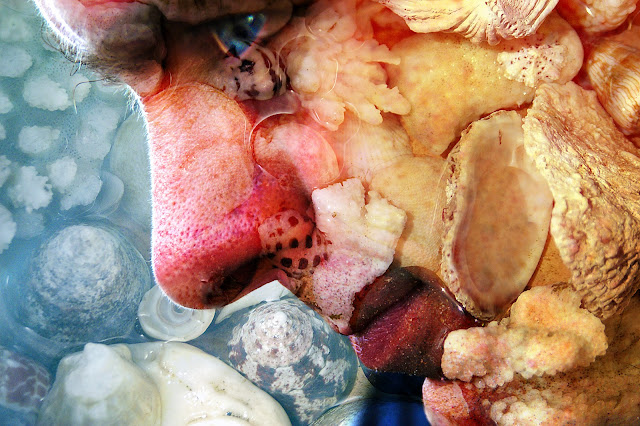
Just for a complete change....here is a photo I made years ago (yes...I know the idea is to try new things but when I rediscovered this image I couldn't resist a little “show and tell”). As a long time passed since I did this, I can't remember the specific details, but it doesn't really matter as each photo is unique and will need slightly different treatment to get a similar result. The process if you want to play, though, is straightforward. Take two photographs – a close-up of a face (side-on may work best as there's more skin and less features), and something for “texture”. My husband who only looks half this scary in reality was “the face” and the texture was a dish of shells (you could use a tree trunk or grass or dog fur or pasta etc etc). In Photoshop or Elements open both pictures and drag the texture over the face. Try each of the blending modes in the layers palette until you find one you like. Now you need to select the eraser and remove the texture from any important details that may be obscured. This is especially important for the eyes, as they are the feature that attract most attention. In this case I then selected the eye and increased the saturation so it was quite intense, and added a little glint of “light”with the brush tool, although this is optional. Finally collapse your layers and save the image. You won't always get wonderful results but its fun playing around until you find a successful combination.

Saturday, 19 May 2012

PAINT AND SAND EMBOSSING

This is a simple background technique.  Simply paint a "dyed-through" paper such as Bazzill with a thin layer of a contrasting colour (in this case gold).  When it is completely dry, run it through your embossing machine and use an emery board or fine sandpaper to remove the paint from the raised areas.

Saturday, 12 May 2012

COLOURING WITH PENCILS

As I've mentioned, I still have a long way to go before I'll be happy with my colouring skills, but on the off chance that I might improve with practice, I've decided to stop being negative and get on with it!  These examples were coloured with pencils (an assortment of brands) and blended with Zest-it.  The stamps are from Hampton Art/Graphic 45.  I like the effect of the neutral grey around the main image. 

Saturday, 5 May 2012

STICKER MASKS

A simple but effective way to use outline stickers is as a mask.  In this example I've sponged over some distress ink and then added a second layer of a darker brown ink over the top of the butterfly stickers.  Its a bit hard to see in the picture, but the middle section (wrapped in gold thread) is slightly raised above the base.  Its called "begin" because I'm doing a demo on such things in August and I had to start somewhere......................... 

Saturday, 28 April 2012

AUTUMN LEAVES


 Well its Autumn!!! I couldn't resist picking some leaves from the garden and scanning them so that I could use them in digital projects. I put a black sheet of card behind so that selecting individual leaves would be easy (using the magic want tool). The individual leaves have been run with the “poster edge” filter in Elements although you could use many of the others to great effect (or just leave them alone!). I've reassembled the single leaves into one composite picture which is a bit kitsch but gives the general idea of the whole copy and paste thing.....I'm sure the leaves could be  used in much more tasteful ways!! (For the keen gardeners....yes there is one ring-in...a Nandina leaf). Feel free to copy the leaves and play.


Saturday, 21 April 2012

3D STAMPiNG


Completed Card

Initial Image
This is a simple 3D card using a Kaiser acrylic stamp.  I first stamped it with black ink onto white paper and then scanned the image, increased the size, and printed it twice onto three different colours of card.
The red was used as a base.  The next layer was cut out of dark pink card around the inner outline (as shown) and the final layer was made up of the inner shape, cut out of cream card.  The cut pieces were assembled on top of each other using double sided tape and two different thicknesses of foam tape.


Saturday, 14 April 2012

CRUMPLED TISSUE PAPER


This is a super easy background that I have seen in several books and on other sites, and yet somehow haven't actually tried out until now. It just seemed too simple.......Now I wish I'd played with this idea earlier. All that it needed is some tissue paper, glue and cardboard backing. Scrumple up the tissue paper (I repurposed some that came with my new shoes). Coat a sheet of card ( I just used 200g white copier card) with glue (I ended up using Aquadhere on the sound grounds that it was sitting on my work table at the time). Then stick the crumpled tissue onto it, retaining most of the wrinkles in the paper. Trim the edges and that it! It looks good enough to use “as is” but you could colour with paint or highlight with ink.

As a digital card/scrapbooking background it can be scanned and easily coloured in Elements by selecting the “Enhance” then “Adjust color” then “Adjust Hue and Saturation”. Tick the colorize box and play around with the sliders until you've achieved the desired colour. 

The thing that I think I'll be doing most often, however, is to use the scanned paper to add texture to photos. Open your scan of crumpled tissue , then open the photo you wish to use. Hold the left button down and drag the tissue scan from the project box onto the photo. Then play with the blending modes until you find one you like.  The Church at the left used "Color Burn" and the one on the right used "Hard Light."

Saturday, 7 April 2012

EMBOSSED ACETATE OVERLAY


I really wanted to use one of my  new World Fair embossing folders with this face stamp (from Rubbadubbadoo) but couldn't quite get it all together.  Embossing can make circles look distinctly dodgy and faces more than a little frightening.

Inspiration struck .......(eventually) and I embossed a piece of acetate and attached it as an overlay.  It worked surprisingly well, so its a technique I'll be using again.

The cogs are Spellbinders dies, the card is made from Bazzill, the split pins are from Regal Craft and the letter stickers and paper are Kaiser.

Saturday, 31 March 2012

BLACK EMBOSSED BACKGROUND

This background started as a bit of black card on which I was removing excess red paint from a brush I was using on another project.  I was about to throw it away when I thought....actually that has potential. 
A quick roll through the Cuttlebug and a bit of gold ink dragged over the top and there you are........I like it better than the ACTUAL background I was trying to make!!

Saturday, 24 March 2012

PUNCHED DRAGONFLIES AND FLOWERS


Remember the olden days....before die-cutting machines and fancy papers? If you weren't doing wonderful things with stamps, chances were, your cards looked something like this. All the shapes (squares, dragonflies and daisies) were cut using hole punches. All the paper is cheap as chips (140g office paper) except for the dragonflies and two diagonal corner daisies which were punched from curious metallics ice gold shimmer paper to add a bit of subtle highlighting. (We upped the budget to .45c a sheet for this). I cheated a bit by embellishing with Kaiser adhesive pearls (in “the day” it would have been something like liquid pearls). I know I've also strayed a little bit from my stated intent for this blog, as paper-punching is not a new technique but every now and again it doesn't hurt to re-visit some “oldies but goodies”, and as I've made a promise to myself to do something different every week, I might have to dust off some treasures from the vault now and again!