Showing posts with label Background techniques. Show all posts

Saturday, 17 March 2018

ERASER STAMPED BACKGROUND

TWO EXAMPLES OF ERASER BACKGROUNDS
Sometimes I just want to add a little bit of a feature in the background without compounding the busyness of the rest of the project.

A really easy way to do this is to ink up the side of an eraser and use it as a stamp to add colour. 

The example on the right uses three shades of overlapping brown - I've overdone it a bit here, to make the point, and would chose more subtle colours for a "real" card.  The silver behind the stamped rope on the first  card front is more the go.

Of course, its just a matter of what you like.  I often just use the eraser technique to add a single panel of a subtle colour (use Versamark) behind a stamped image.

Friday, 17 November 2017

BANDANA STAMPING

BANDANNA STAMPING
This is not my idea but there are so many examples on-line that I don't know who to thank for the technique.   Have a look and you will find many better examples that this so thank you to everyone who has posted their work for us to enjoy and be inspired by.

Begin with a watercolour background.  (I've used my favourite smooshed distress inks applied with an acrylic block - see the last post).

Stamp on some images with blank ink.  I arranged them on a single block and stamped them all at one time so I could do a test run first.  Next just colour in a section or two of the stamps with white gel pen and add a few lines and  a little dotted border here and there. No skill needed for quite an effective result.  This is one example which looks better in reality, and is fine as a sample.  I'll definitely be giving it a go a little more carefully (to get the dots more evenly sized and placed, and the straight lines straight etc) in the future.


Saturday, 14 October 2017

ACRYLIC BLOCK DISTRESS INK BACKGROUND

ACRYLIC BLOCK "PRINT" BACKGROUND
One of my very favourite ways to make a watercolour background (because its easy and almost always looks good) is to ink up an acrylic stamping block with distress inks, spritz on a tiny bit of water and then "print" it onto dampened paper.

I have done a post about this before, but thought this might be worth a view as it shows how easily one can suggest sunset scene via colour selection and an appropriate silhouette stamp.

You obviously won't get precise colour placement with this technique but its worth spending a little time thinking about the placement of  the various inks on your block to correspond to your stamp e.g. sand, sea and sky; flowers, leaves container etc.

(The stamp is from Darkroom Door)

Sunday, 12 March 2017

SMALL STAMPS AS A BACKGROUND

SMALL STAMPS AS A BACKGROUND
Its been a while since I've posted - no bad reason, just busy with other things, but I will do my best to put up something new at least once a month for the rest of the year!

I seem to have accumulated a lot of little stamps.  Often they come as part of a larger set.  I often add one to the back of a card, but thought it was about time to get them out of the cupboard and see what else I could do with them.

Making backgrounds is one idea.  These little chaps were part of a Kaiser set, and using different coloured ink for each design I've just more or less randomly stamped them over the front of the card, overstamping some of the edges.

 I used an oval cut-out to mask an area towards the top of the card to leave a clear space for a couple of larger stamps.  The result is slightly dodgy as I deliberately wanted a handmade look (honestly this time, although often I "achieve" this when I don't want to).  If you want a cleaner look, draw in some guidelines lightly with pencil to make sure the mask and stamps within it are straight and centred, and be sure to press very lightly and not overink your stamps to stop unwanted edge lines (which are harder to avoid with little stamps).

I made this card as an example rather than one I intend to give to anyone, but like it enough to want to play around a bit more with the technique

Sunday, 6 November 2016

SANDING SHIMMER CARD FOR A "RUSTY" LOOK

A few techniques combine on this picture.

The one I was "showing" was that shimmer card (the copper of the ute) has a colour core so when you sand it, a matte colour shows through, in this case making the Ultimate Craft's"Rusty Old Ute" die look quite rusty!

The background was a combo of gold and copper paint randomly applied to turquoise card, then stamped with a corrugated iron background stamp (from Darkroom Door), but without using a block and just applying uneven pressure with my fingers so that not all the image stamped.  Heat embossing with silver pwder and a drawn silver line complete the background.

Wednesday, 10 August 2016

CUT STRIP BACKGROUND

CUT STRIPS
COMPLETED BACKGROUND
This easy background is a simple way to use up leftover papers.

I used a dark brown background card.  The papers were cut at an angle....just somewhat randomly, an then stuck them side by side with a little gap between.

Then the layers were sliced vertically and reassembled, alternating top and bottom, and leaving a similar sized gap.

I've used "outback" colours with a bit of copper shimmer to lift it, but I think if you used a black base and primaries you'd get a very sixties look which could be fun.

Saturday, 6 February 2016

STAMP AND EMBOSS PRINTING

Stamp and Folder

Stamped Embossing
This is a quick and easy technique that could result in some really interesting backgrounds - I'm not claiming that my example is one of them, but it should give you some idea of how it works.  I've used a foam stamp (any stamp will do but I'm fairly sure that the less detail the better), ink it up with a non-permanent ink (I've used a chalk pigment), stamp onto your embossing folder, then insert a piece of paper or card and run through your Cuttlebug (or Bigshot etc).  I'm going to play a bit more with this technique - perhaps make some of my own stamps from fun foam?  If it works out I'll post the results at a later date.

Saturday, 7 November 2015

BACKGROUND WITH RICE AND ACRYLIC PAINT

RICE ON WET PAINT
 I'm always keen to try new background techniques, but as this one is a bit on the messy side, I haven't had the chance to try it until now.  (Hence I have forgotten the source of the idea.....sorry....happy to credit if you want to claim it as your own).

The idea is basically just to spread a layer of very watery acrylic paint, and then sprinkle rice on top immediately.

After the paint is completely dry, the rice is removed.  The rice absorbs some of the paint, leaving paint-free areas, and creating patterns.

As you can see, it worked OK.....not remarkably.  I think it would probably be better had a used a less absorbent paper as the background so that more liquid is taken up by the rice.  I also found it impossible to remove the rice without ripping some of the paper underneath.  This isn't necessarily bad - it does have its own "look."

All in all I'm glad I finally got around to trying this technique but don't think I'll be using it frequently. There are easier ways of creating similar effects, and in terms of the lay on/take off technique, salt seems more reliable.  Still, if you haven't tried it its worth a go.  I imagine dark blue paint on gold or silver paper might make a nice starry sky.........
RICE PATTERNED BACKGROUND

Saturday, 5 September 2015

CLEAR EMBOSSED BLACK CARD

CLEAR EMBOSSED BLACK CARD
This is a rather bad photo of clear-embossed Versamark on a black background.  I hope you take my word for it, that it does, in reality look great!!

I used a flash to photograph it, hence, the reflection of the stamped image, and the appearance of a far greater contrast between the image and background than exists in the real world.

The actual example is very subtle and would make a great background for cards.  Try it yourself to see!!

Saturday, 17 January 2015

DOUBLE LAYER STAMPING ON A BOOK PAGE

TWO LAYER STAMPING ON TEXT
A couple of weeks ago I posted an example of stamping onto a book page.  This is fine with a solid stamp, but works less well with a stamp that has fine detail such as this typewriter from Rubbadubbadoo, which tends to get lost amongst the text.

One solution is to make a background stamp - I used fun foam cut with deckle scissors - stamp over the text with this, then stamp your feature stamp on top using a darker ink.

I whipped this example up fairly quickly and would probably use a lighter brown for the background and a very dark cocoa brown for the typewriter if I was making for a "real" project.
MAKE A BACKGROUND STAMP

Saturday, 13 December 2014

SHADOW STAMPING WITH ACRYLIC STAMPS

REVERSE STAMP BACKGROUND
Oh dear, this is not an original idea but I can't remember where I heard/saw it.....I'm happy to add an attribution if anyone could suggest the source.

Anyway its a simple but fabulous idea - just use a tiny bit of double sided tape to stick your acrylic stamp upside down on your stamping block, and then use it as a "shadow" for underneath the image.  In this example I used silver underneath and crimson on top.  You'll have to take my word for it that it looks better in reality.

(I probably shouldn't mention that a little lick and stick is a speedier way than double sided tape to stick the stamp onto the block for the first step.)

Saturday, 15 November 2014

NAIL POLISH MARBLING

NAIL POLISH MARBLING
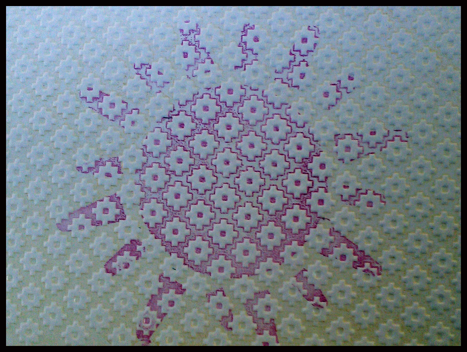
R. Maria Sabina wrote an article for Craft Stamping magazine outlining this technique and I couldn't wait to try it!  Basically you just drop some nailpolish on top of water, swirl it with a toothpick and print off the result.

As with most things it wasn't quite as easy as this.  The author did address most of the issues I had but of course I read the article properly after
the issues arose.  So, for fellow skim-readers here's a few tips.

Firstly unless you have a very warm room, use lukewarm water - most of the nailpolishes I used just sank in little drops to the bottom - something I ascribed to the brand (which did make a difference) but was probably a temperature issue.

Secondly, as mentioned, all the polishes I used were of the cheap and chips variety (no more that $2.50 per bottle) but there was a lot of variation between brands - some just sank, others created a "skin" on the top of the water, and a couple of the brands seemed to interact with each other to make a sort of lumpy mess.  In other words - buy one bottle of a single brand and do a test run before you get carried away.

Thirdly gloss card has bolder results than matt but the latter still gave a nice albeit more subtle result.

And lastly......wear rubber gloves, or you'll be typing up your blog posting with dark green fingers!!!!!

Despite making a bit of a mess of the whole thing, I was. overall, pleased with the results, and might give it a go again soon, having learnt a few lessons from the first attempt.

Saturday, 1 November 2014

CORK STAMPING AS DIGITAL PAPER

I haven't done any digital bits for a while so I thought it was about time.  I keep some examples of things that I really don't like as well as ones that I do (although not as many of them!).  It sometimes helps to try and work out what it is that you don't like, so that you can produce more work that you do.  (If that makes sense).  My start image was this rather horrible concoction of stuck together papers and brown paint stamped on with a cork so.......what don't I like?  Well, for starters the colours are foul, the white panel is too stark and the cork stamping just looks like muddy blodges.  so can it be saved??

I opened up the picture in Elements and started with the colours which just don't work together.  I played around with variations adding lots of blue and green until it looked a bit better.  The cork stamping still looked a bit splodgy and messy to I went into the filters gallery and from the Pixelate section selected and applied "Pointillise" which introduced a little order to the "blodges".  Last of all I just used the elements cookie cutter tool to cut out a butterfly and there you are...!!
Truthfully, I probably won't ever use this background again, but I had fun trying to make it at least semi-presentable!!


Saturday, 30 August 2014

TORN PACKAGING FOR BACKGROUNDS AND TEXTURE

TORN PACKAGING FOR BACKGROUNDS
People are ripping packing card apart all over the internet at the moment.  More talented folk than me are even ripping patterns and complicated designs.  I thought at the very least I should give it a go.  As I don't do a lot of grunge style work I wasn't anticipating it being very useful for my cardmaking but the effect is kind of compelling and may yet find its way to a sample card or two in the future.

It did, however, occur to me that a scan or photo of the torn card would make a terrific texture to add to some of my photos.  The two I've played with aren't "quite there" but, as you can see, its worked well enough to justify a bit of playing around.  Just drag the torn card photo on top of another picture and play with blending modes in Elements, if you'd like to try for yourself.

SUPER-SATURATED AUTUMN LEAVES
+ TEXTURE

SEPIA + TEXTURE

Saturday, 2 August 2014

STAMPED BABY WIPES

Stuck to card with Jac paper
Cut shell with babywipe background
Alcohol-free baby wipes make stamp-cleaning easy, especially if you're crafting away from home.

These really thick, soft ones from a well-known chain store (oh, OK, from Target) also make brilliant backgrounds.  No need to be too fussy - just avoid cleaning colours opposite each other on the colour wheel on the same cloth unless you want a bit of a murky mess (even that might have applications).

The next step of this "non-technique" came about when I left a recently (over) inked shell stamp face down on a cloth and found that it had left a very clear impression, even given a bit of bleeding of the ink.  Stuck to cardboard with double sided Jac paper, and then cut out with scissors, leaving just a little border all around, the shell makes a really interesting embellishment, with a great soft furry texture.

Saturday, 19 July 2014

3D WITH STAMPS

SIDE VIEW
 There are a couple of techniques to share this week.  The first is a background.  Versamark Dazzle is an ink pad that has a similar effect to normal Versamark (i.e. it shows stamped on dyed-through papers a shade or two darker than the paper colour) but adds a little sparkle as well.  Its not over the top, just a subtle shimmer (which obviously doesn't photograph easily).
The background here has been made with a variety of Darkroom Door stamps.

3D SHELL CARD
The main shells are from Graphic45, which brings us onto technique 2, which is to add a little dimension by stamping two images, cutting the second smaller than the first and then fixing it over the top with foam tape or silicone glue.  It works best if you do a little shaping first.  There are tools and mats with which you can do this, but gently stroking the middle of the shape in the palm of your hand works for a little project such as this one.

Saturday, 5 July 2014

LEAF-PRINTED BACKGROUND

LEAF PRINT BACKGROUND
 I bought a really nice set of leaf stamps recently, but there is an alternative - real leaves!!  This little bunch came from a banksia rose.  I just dabbed some Versacolour ink directly onto the underside of the leaves. Pigment inks are a bit stickier than dye-based ones and I suspect work best for this, though I'm happy to be corrected.  I'd already made a base background by "printing" with distress inks on an acrylic block (as in a recent post).  the brighter green is the first print, the more subtle example is the second print.  I placed the inked leaves on top and brayered over the top to apply an even pressure, and made a couple of prints before re-inking.  I applied them in a random way, similarly to the stamps in last week's example.
The results with rubber stamps are obviously more predictable but this approach will produce a truly unique result (which you can of course scan if you want to reproduce it).

Saturday, 28 June 2014

OVERSTAMPED BACKGROUND ON TEXTURED CARD

 Perhaps I should have called this the "Background" blog but for whatever reason its backgrounds that are interesting me most at the moment.  I guess I'm trying to wean myself from reaching for the patterned paper all the time, and I'm pleased to find there are many quick alternatives.  This one in particular, takes less time that cutting paper to size and putting on some doublesided tape.

OVERSTAMPED BACKGROUND
In this example I've stamped multiple times onto a textured ivory card, inking about every third time, and stamping over the edges.  I tried with a few different stamps but it seems to work best with a fairly solid one (the flower and shell are both from Darkroom Door).  I used Versafine ink, which is good for detail because even although the result of the overstamping and the texture is abstract, I wanted the shape to remain evident.

To complete the card, I would stamp a single image onto co ordinating smooth card, double mount it on ivory and green (or blue for the shells) and place it in the centre of the card.  Of course, that's just one option.

Saturday, 21 June 2014

SALT AND ACRYLIC WASH BACKGROUND

SALT AND ACRYLIC WASH
I love this paper!!   Just brush a very watery layer of acrylic paint over a sheet of thick paper (I use a dark green paint from Kaiser), then sprinkle with salt (I used ground sea salt).  After its thoroughly dry brush off the salt and you're left with tiny little specks where the grains of salt lay.  In this example they look a bit like miniature moon craters.  I think you could do some great faux rust with oranges and red.
I've seen this technique used with different colouring mediums (watercolours, ink) and different salts, and suspect all the combinations may produce somewhat different results - certainly worth exploring!!

Saturday, 14 June 2014

DISTRESS INK AND ACRYLIC BLOCK BACKGROUNDS

DISTRESS INK & ACRYLIC BLOCK BACKGROUND
As you can probably tell by now, I've just bought myself some new Distress Ink sets. I've been reading about inking backgrounds using a craft mat and wondered, given I usually worked on a small scale, whether or not an acrylic block would work.  It does!
Just blob a colour or two of distress ink straight from the pad onto a large acrylic block, spritz it with water until the colours start to run together and blend then either turn it over and "stamp" onto your paper/card, or alternatively, put the paper onto the block.  If you do the latter you can smooth it over with your hand which helps the colours to blend.
CLOSE UP