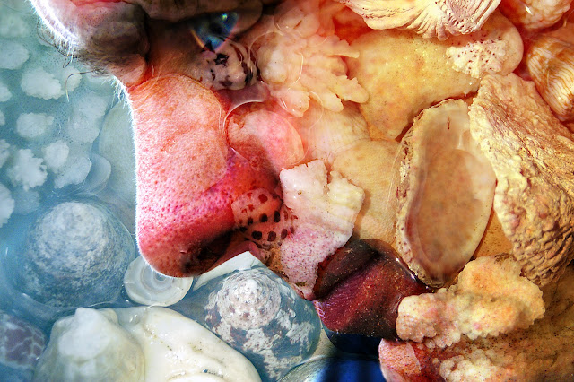
Just for a complete change....here is a
photo I made years ago (yes...I know the idea is to try new things
but when I rediscovered this image I couldn't resist a little “show
and tell”). As a long time passed since I did this, I can't
remember the specific details, but it doesn't really matter as each
photo is unique and will need slightly different treatment to get a
similar result. The process if you want to play, though, is
straightforward. Take two photographs – a close-up of a face
(side-on may work best as there's more skin and less features), and
something for “texture”. My husband who only looks half this
scary in reality was “the face” and the texture was a dish of
shells (you could use a tree trunk or grass or dog fur or pasta etc
etc). In Photoshop or Elements open both pictures and
drag the texture over the face. Try each of the blending modes in
the layers palette until you find one you like. Now you need to
select the eraser and remove the texture from any important details
that may be obscured. This is especially important for the eyes, as
they are the feature that attract most attention. In this case I
then selected the eye and increased the saturation so it was quite
intense, and added a little glint of “light”with the brush tool,
although this is optional. Finally collapse your layers and save the
image. You won't always get wonderful results but its fun playing
around until you find a successful combination.
Playing with paper - a technique a week for those who enjoy the journey as well as the destination!
Saturday, 26 May 2012
Saturday, 19 May 2012
PAINT AND SAND EMBOSSING
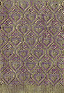 This is a simple background technique. Simply paint a "dyed-through" paper such as Bazzill with a thin layer of a contrasting colour (in this case gold). When it is completely dry, run it through your embossing machine and use an emery board or fine sandpaper to remove the paint from the raised areas.
Saturday, 12 May 2012
COLOURING WITH PENCILS
As I've mentioned, I still have a long way to go before I'll be happy with my colouring skills, but on the off chance that I might improve with practice, I've decided to stop being negative and get on with it! These examples were coloured with pencils (an assortment of brands) and blended with Zest-it. The stamps are from Hampton Art/Graphic 45. I like the effect of the neutral grey around the main image.
Saturday, 5 May 2012
STICKER MASKS
A simple but effective way to use outline stickers is as a mask. In this example I've sponged over some distress ink and then added a second layer of a darker brown ink over the top of the butterfly stickers. Its a bit hard to see in the picture, but the middle section (wrapped in gold thread) is slightly raised above the base. Its called "begin" because I'm doing a demo on such things in August and I had to start somewhere.........................
Saturday, 28 April 2012
AUTUMN LEAVES

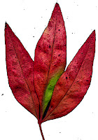
Well its Autumn!!! I couldn't resist picking some leaves from the garden and scanning them so that I could use them in digital projects. I put a black sheet of card behind so that selecting individual leaves would be easy (using the magic want tool). The individual leaves have been run with the “poster edge” filter in Elements although you could use many of the others to great effect (or just leave them alone!). I've reassembled the single leaves into one composite picture which is a bit kitsch but gives the general idea of the whole copy and paste thing.....I'm sure the leaves could be used in much more tasteful ways!! (For the keen gardeners....yes there is one ring-in...a Nandina leaf). Feel free to copy the leaves and play.
Saturday, 21 April 2012
3D STAMPiNG
This is a simple 3D card using a Kaiser acrylic stamp. I first stamped it with black ink onto white paper and then scanned the image, increased the size, and printed it twice onto three different colours of card.
The red was used as a base. The next layer was cut out of dark pink card around the inner outline (as shown) and the final layer was made up of the inner shape, cut out of cream card. The cut pieces were assembled on top of each other using double sided tape and two different thicknesses of foam tape.
 |
| Completed Card |
 |
| Initial Image |
The red was used as a base. The next layer was cut out of dark pink card around the inner outline (as shown) and the final layer was made up of the inner shape, cut out of cream card. The cut pieces were assembled on top of each other using double sided tape and two different thicknesses of foam tape.
Saturday, 14 April 2012
CRUMPLED TISSUE PAPER
This is a super
easy background that I have seen in several books and on other sites,
and yet somehow haven't actually tried out until now. It just
seemed too simple.......Now I wish I'd played with this idea earlier.
All that it needed is some tissue paper, glue and cardboard backing.
Scrumple up the tissue paper (I repurposed some that came with my new
shoes). Coat a sheet of card ( I just used 200g white copier card)
with glue (I ended up using Aquadhere on the sound grounds that it
was sitting on my work table at the time). Then stick the crumpled
tissue onto it, retaining most of the wrinkles in the paper. Trim
the edges and that it! It looks good enough to use “as is” but
you could colour with paint or highlight with ink.
As a digital
card/scrapbooking background it can be scanned and easily coloured in
Elements by selecting the “Enhance” then “Adjust color” then
“Adjust Hue and Saturation”. Tick the colorize box and play
around with the sliders until you've achieved the desired colour.

 The thing that I
think I'll be doing most often, however, is to use the scanned paper
to add texture to photos. Open your scan of crumpled tissue , then
open the photo you wish to use. Hold the left button down and drag
the tissue scan from the project box onto the photo. Then play with
the blending modes until you find one you like. The Church at the left used "Color Burn" and the one on the right used "Hard Light."
The thing that I
think I'll be doing most often, however, is to use the scanned paper
to add texture to photos. Open your scan of crumpled tissue , then
open the photo you wish to use. Hold the left button down and drag
the tissue scan from the project box onto the photo. Then play with
the blending modes until you find one you like. The Church at the left used "Color Burn" and the one on the right used "Hard Light."Saturday, 7 April 2012
EMBOSSED ACETATE OVERLAY
I really wanted to use one of my new World Fair embossing folders with this face stamp (from Rubbadubbadoo) but couldn't quite get it all together. Embossing can make circles look distinctly dodgy and faces more than a little frightening.
Inspiration struck .......(eventually) and I embossed a piece of acetate and attached it as an overlay. It worked surprisingly well, so its a technique I'll be using again.
The cogs are Spellbinders dies, the card is made from Bazzill, the split pins are from Regal Craft and the letter stickers and paper are Kaiser.
Saturday, 31 March 2012
BLACK EMBOSSED BACKGROUND
This background started as a bit of black card on which I was removing excess red paint from a brush I was using on another project. I was about to throw it away when I thought....actually that has potential.
A quick roll through the Cuttlebug and a bit of gold ink dragged over the top and there you are........I like it better than the ACTUAL background I was trying to make!!
A quick roll through the Cuttlebug and a bit of gold ink dragged over the top and there you are........I like it better than the ACTUAL background I was trying to make!!
Saturday, 24 March 2012
PUNCHED DRAGONFLIES AND FLOWERS
Remember
the olden days....before die-cutting machines and fancy papers? If
you weren't doing wonderful things with stamps, chances were, your
cards looked something like this. All the shapes (squares,
dragonflies and daisies) were cut using hole punches. All the paper
is cheap as chips (140g office paper) except for the dragonflies and two diagonal
corner daisies which were punched from curious metallics ice gold
shimmer paper to add a bit of subtle highlighting. (We upped the
budget to .45c a sheet for this). I cheated a bit by embellishing
with Kaiser adhesive pearls (in “the day” it would have been
something like liquid pearls). I know I've also strayed a little bit
from my stated intent for this blog, as paper-punching is not a new
technique but every now and again it doesn't hurt to re-visit some
“oldies but goodies”, and as I've made a promise to myself to do
something different every week, I might have to dust off some
treasures from the vault now and again!
Saturday, 17 March 2012
MASKING TAPE BACKGROUND
I
have been looking at Trish Bee's wonderful site at
http://techniqueszone.wordpress.com/
and been inspired to try one of her background techniques which
involves tearing off pieces of masking tape,, sticking them to paper
or card and then inking over the top. As luck would have it, I had a
roll of ultra-sticky “well-past-its-use-by” masking tape in my
craft lair which helpfully kept breaking while I was ripping pieces
off. Anyone who knows me is aware that I just hate throwing things
out, so this project was a perfect way to use up an otherwise useless
product. (And no, I don't expect its acid-free or archival).
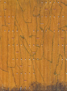 I stuck the tape to a piece of 200g
card and instead of inking, painted over the surface with some Kaiser
acrylic paint (brown made with a lot of red, a bit of yellow and a
teeny bit of black). This seems to give a more subtle end product
than the ink. I ran out of paint and had no way of matching the
colour (as I had not, of course measured it), so I made a second
brown mix with the same colours but reversing the quantities of red
(this time just a little) and yellow (lots).
You can see the first
(darker brown) example without embellishment. I ran the yellow-brown
through my Cuttlebug (favourite toy of all time) using the Couture
Creations “Fretboard” embossing folder. I then coloured the
nail-holes silver and the joints between the boards brown, using
pens. The nails look OK but I wish I'd left the joints alone. I
might try going over them with a darker colour.
Saturday, 10 March 2012
VERSAMARK RESIST
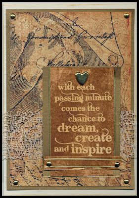 VERSAMARK
RESIST is an oldie but a goodie, and a technique I haven't used for
ages. Stamp with Versamark (or other clear slow-drying ink), emboss
with clear embossing powder, brayer over with ink (Distress inks work
well as they're thin) then, if necessary (and it wasn't in this
case), wipe excess ink from the embossed area. The embossing
protects the paper underneath so the original colour (in this case
Kula Cream) is retained. You can, of course also do this with
patterned paper but I think I'll use that as another post! The stamp
is from Darkroom Door “Artist” stamp set. The card topper is ATC
size and could have been used as this instead of being mounted on a
greeting card
VERSAMARK
RESIST is an oldie but a goodie, and a technique I haven't used for
ages. Stamp with Versamark (or other clear slow-drying ink), emboss
with clear embossing powder, brayer over with ink (Distress inks work
well as they're thin) then, if necessary (and it wasn't in this
case), wipe excess ink from the embossed area. The embossing
protects the paper underneath so the original colour (in this case
Kula Cream) is retained. You can, of course also do this with
patterned paper but I think I'll use that as another post! The stamp
is from Darkroom Door “Artist” stamp set. The card topper is ATC
size and could have been used as this instead of being mounted on a
greeting cardSaturday, 3 March 2012
DIGITAL RESIN FLOWERS
I can't decide whether or not I like resin flowers, but when I was playing
around with some of my flower pictures I worked out that it was
actually super easy (if you have Elements or a similar programme) to
make a digital variety to experiment with (or “with which to
experiment” if you don't like sentences ending with prepositions –
blame my husband for the little voice in my head that made me add
this). Here is how to make your own digital resin flowers
- Pick a suitable flower and photograph it on a piece of black paper. (There are less shadows in black backgrounds so the area is easier to select with the magic wand)
- Select the background by clicking on it with the magic wand tool (four down on the left in the tool menu), making sure that the box labelled “Contiguous” at the top of the page is ticked. Click on Edit at the top of the page, and then “Cut”.
- If necessary (and with any luck you won't have to do this) tidy up any messy bits around the edges of the flower with the eraser tool (side menu)
- Click on the new background with the magic wand tool again then click on “Select” (at the top of the page) and then on “Inverse” so that the flower is selected.
- Next click onto “Filter” (also at the top), then “Artistic” then “Plastic wrap.” Put the side sliders to high Highlight strength, low Detail and medium Smoothness. (Play around until you like the effect)
- Go to “Enhance”, then “Adjust colour”, then“Adjust Hue and Saturation” and click on the “Colorize” box to put a tick in it.
- Now play around with the Hue and the Saturation sliders to make the flower the colour that you want.
- Now copy and paste into your project or save your flower for future use (remember to select it each time so you don't get the background too!) You can add a bevel from the Effects menu if you want a more three dimensional look.
Saturday, 25 February 2012
GESSO, GEL PENS AND EMBOSSING
This is a hybrid card but
you could make something very similar without your computer. To make
the background, I embossed lightweight black card with the Cuttlebug
Owl Flourish folder. I roughly coloured in parts of the owl and
swirly bits with gold and silver pens and then covered the lot with a
thin coating of gesso. After it was completely dry I gave it a light
sanding. I was a bit disappointed that the gold and silver didn't
show up quite as well as I'd hoped, but was still pleased with the
overall result. (See small picture) From this point on, I scanned
the result and added the border (stroke in dark grey sampled from the
image), greeting (in the same colour), moon (highly feathered
circular selection filled with light gold on a separate layer so a
little could be removed with the eraser from the owl) and eye
highlights (oval selections filled with white) with digital effects. You could easily achieve similar results by mounting the owl on a
dark grey card, stamping and embossing a greeting, sponging on gold ink for the moon,
and finally adding eye highlights with a white gel pen.
FLATTENED WINDMILL CARD
This
panel is made is made from four small windmills, flattened, and stuck
down flat. To make the “windmills”, fold and unfold squares in
half along the diagonal (so the folds make a big X), cut from each
corner half way down the fold line towards the centre and finally
fold every second tip to the centre and secure (I used a little
double sided tape and then a split pin, which also serves as a
feature for the centres). After attaching the squares to the backing
paper, add a fifth split pin to the middle for decoration.
Double-sided paper usually works best, especially when its mounted on
a contrasting colour.
Subscribe to:
Posts (Atom)
