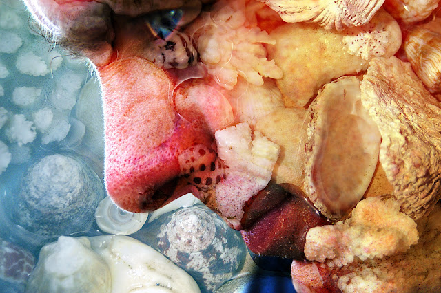
Just for a complete change....here is a
photo I made years ago (yes...I know the idea is to try new things
but when I rediscovered this image I couldn't resist a little “show
and tell”). As a long time passed since I did this, I can't
remember the specific details, but it doesn't really matter as each
photo is unique and will need slightly different treatment to get a
similar result. The process if you want to play, though, is
straightforward. Take two photographs – a close-up of a face
(side-on may work best as there's more skin and less features), and
something for “texture”. My husband who only looks half this
scary in reality was “the face” and the texture was a dish of
shells (you could use a tree trunk or grass or dog fur or pasta etc
etc). In Photoshop or Elements open both pictures and
drag the texture over the face. Try each of the blending modes in
the layers palette until you find one you like. Now you need to
select the eraser and remove the texture from any important details
that may be obscured. This is especially important for the eyes, as
they are the feature that attract most attention. In this case I
then selected the eye and increased the saturation so it was quite
intense, and added a little glint of “light”with the brush tool,
although this is optional. Finally collapse your layers and save the
image. You won't always get wonderful results but its fun playing
around until you find a successful combination.
Playing with paper - a technique a week for those who enjoy the journey as well as the destination!
Saturday, 26 May 2012
Saturday, 19 May 2012
PAINT AND SAND EMBOSSING
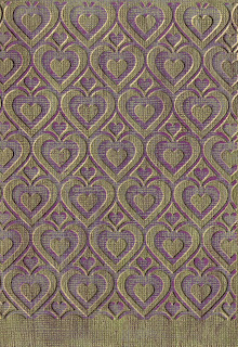
 This is a simple background technique. Simply paint a "dyed-through" paper such as Bazzill with a thin layer of a contrasting colour (in this case gold). When it is completely dry, run it through your embossing machine and use an emery board or fine sandpaper to remove the paint from the raised areas.
Saturday, 12 May 2012
COLOURING WITH PENCILS
As I've mentioned, I still have a long way to go before I'll be happy with my colouring skills, but on the off chance that I might improve with practice, I've decided to stop being negative and get on with it! These examples were coloured with pencils (an assortment of brands) and blended with Zest-it. The stamps are from Hampton Art/Graphic 45. I like the effect of the neutral grey around the main image.
Saturday, 5 May 2012
STICKER MASKS
A simple but effective way to use outline stickers is as a mask. In this example I've sponged over some distress ink and then added a second layer of a darker brown ink over the top of the butterfly stickers. Its a bit hard to see in the picture, but the middle section (wrapped in gold thread) is slightly raised above the base. Its called "begin" because I'm doing a demo on such things in August and I had to start somewhere.........................
Subscribe to:
Comments (Atom)


