Playing with paper - a technique a week for those who enjoy the journey as well as the destination!
Saturday, 29 December 2012
STAMPING WITH CORKS
Another simple background technique this week....and one you may well have tried as a little person. As is sometimes the case, this looks more effective in reality that in the photo, as the metallic ink and embossing lose some of their shine "in translation". The technique is simply to use cork as a stamp. In this example I've used white and gold acrylic paint, and then added some round gold stamps. Ink would give a more even result. The edge of the circle has been rubbed roughlyy with versamark and then heat embossed with gold powder. the stamp on the red circle is also embossed.
Labels:
Background techniques,
Embossing,
Stamping
Location:
Riverside TAS 7250, Australia
Saturday, 22 December 2012
STAMP PAD BACKGOUNDS
At this time of year there is no time for complicated techniques so this is about as simple as it can be. I've just punched out some squares from textured card, pressed a little square pink stamp pad lightly onto the middle (not really trying to get the edges to print). After a couple of moments drying time I've overstamped with little motifs, using black inks.
Use one to decorate a gift card, three for a standard "rectangular" card and all four for a square card.
Use one to decorate a gift card, three for a standard "rectangular" card and all four for a square card.
Labels:
Background techniques,
Stamping
Location:
Riverside TAS 7250, Australia
Saturday, 15 December 2012
STAMPING ON AIR DRY CLAY
I'm cheating again on the "new technique" front as I made this box top literally years ago. The photo doesn't really do it justice so you'll have to take my word for it still looking as bright as the day it was made. I've just stamped into DAS air-drying clay with a stamp (unfortunately I can't remember the brand but am happy to credit it if anyone does know). I've then coloured in with a variety of Gel pens, edged with black permanent pen and added lots of glitter glue. I can't remember what I used to attach it to the little paper mache box, (which is covered with handmade paper) but after more than six years its still attached!!
Saturday, 8 December 2012
RUB-ONS ON SHELL
I have more than my share of moments when I buy something that I'm quite sure will come in useful one day, but don't quite know when that day will come. As a consequence I have far too much "stuff". Every now and then, I feel compelled to do a bit of sorting with "use it or lose it" in mind. It never lasts very long but usually I end up giving one or two things away and actually using a couple of other things, before my attention span is exhausted and the rest of the craft room is safe for the next few months.
The orange shell disc in the middle of this card was one of a bag of six I bought thinking that perhaps I could make something in the jewelry line (its intended purpose) but in over two years nothing has sprung to mind. I also have lots of little ends of ribbon that never seem to be quite long enough to use. Add into the mix my rather sad rub-on collection, which I foolishly stored in a warm place with a couple of large books on top hence a sticky mainly unusable stack which I still haven't thrown out.
As you can see, I combined all of these elements, and sat them on top of a teabag motif made with pages from the book I mentioned last week, I then mounted it onto some decorative paper, then onto a card and well....the result is slightly unusual but OK. Plus of course, I can feel slightly smug about finally using some of my more obscure craft room "treasures". The teabag fold is a variation of my favourite kite shape in which one side is opened and secured under the folded side of the next shape. As this blog is supposed to show a different technique each week, I'll go with " Rub-ons on shell" as the title!
Location:
Riverside TAS 7250, Australia
Saturday, 1 December 2012
ROLLED ROSE
I am one of the least likely people you would ever find to rip up a book however.......this one was well and truly falling apart, it was a cheap paperback AND I already had another copy so....I made an exception and now have a couple of hundred nice vintage printed pages to play with. These little rolled flowers are everywhere at the moment. You can buy dies to cut them but I prefer the roughly torn version, as shown in the picture. For those that haven't tried these before: Start by tearing a roughly circular shape (don't be too upset if its not exact, that's the whole idea). Beginning at the outside tear in a spiral shape towards the middle, being deliberately "wavy" and leaving a small area in the middle as a base. Now start rolling from the outside until you get to the base, allow the rolled shape to "relax" a little, then glue it to the base. If you're using light paper like this then double sided tape will do, otherwise use something like Pritt glue or a hot glue gun. If the flower still looks a little tight, you can gently bend out the petals.
Saturday, 24 November 2012
HEAT EMBOSSED INK JET PRINTING .......OR NOT!
Tempted as I am to pretend that everything I try always turns out beautifully, I have to be honest and say that quite often it doesn't. Not that I mind too much.....its all part of the process. this is an example of something I really want to be able to do, but just haven't quite managed to master - heat embossing ink-jet printing. I have seen lots of references in magazines etc. to other folk that have clearly had more success than me, and suspect it may have something to do with paper branding and/or weight. In this example, I printed out the word "July" on gloss photo paper (as advised by one article), applied copper embossing powder and was happy to see it melting as it should when the top coating of the paper swelled up like a piece of bubblegum (quite impressive), and popped (also kind of funny), leaving the end result rather sad and sorry. Perhaps if someone out there has tried this with greater success, they might like to offer advice. Otherwise, I'll keep working on it when time allows until I get it right!!
Saturday, 17 November 2012
GIFT CARD SET
I wanted to make a little gift card set for a demo I did some time ago, but didn't want to spend a week of evenings making it, so I came up with this set. I started with the envelopes as its always easier to make a card to fit an envelope than try to find an envelope to suit an unusually-sized card. As luck would have it I also found a pre-made box which was just the right size. The base cards were made of Bazzill as was the background. the squares were punched from two sorts of Kaiser patterns using my 35mm square hole punch, and the motif was finished with a little red Kaiser pearl. The whole lot were put together in a sort of "assembly line" once all the squares were folded. The whole production only took a couple of hours, including the decoration of the box, and I'm quite pleased with the result.
Labels:
Folding,
Gift Cards
Location:
Riverside TAS 7250, Australia
Saturday, 10 November 2012
PLAYING WITH PENCILS
 |
| ORIGINAL SCAN |
 |
| PATTERN FILL |
 |
| 2CM SQUARE |
 |
| PALETTE KNIFE |
 |
| STAINED GLASS |
Labels:
Background techniques,
Digital techniques
Location:
Riverside TAS 7250, Australia
Saturday, 3 November 2012
ORIGAMI BOXES
I've fiddled around with origami since I was about 8 (which was a very long time ago) and was delighted to come across a site (www.origami-instructions.com) that had quite a few models I hadn't encountered before. These boxes are both pretty, and practical for holding those little bits and pieces like paperclips and split pins etc. There were instructions for lots of different folded flowers too (which I'll be trying as soon as I have some spare time) and lots of other fun things.
Friday, 26 October 2012
TUNNEL 3D
This technique was inspired by the little piece of Kaiser paper at the bottom. I began with a white card with a circle cut-out then mounted a piece of red lightweight card with an extra-large star cut out with a hole punch behind it, using double-sided foam tape to add dimension. a yellow layer with a circular cut out was added in the same way. This was repeated using smaller punches, and finally the scrapbook paper with the yellow star on the red circle was mounted under a final red star cut out.
To make this fairly thick 3d fit into a regular aperture card, second fold lines need to be scored a few mm away from the existing ones to make a thin "box" enclosure.
This will work with any shapes as long as you have punches or dies in several sizes.
To make this fairly thick 3d fit into a regular aperture card, second fold lines need to be scored a few mm away from the existing ones to make a thin "box" enclosure.
This will work with any shapes as long as you have punches or dies in several sizes.
Labels:
Punches and Die-cuts
Location:
Riverside TAS 7250, Australia
Friday, 19 October 2012
PEN ON EMBOSSED DIE CUT
I've combined a few leftovers from previous posts in this little ATC sized card - the left side is printed with paint on hessian, the leaf is a crayon rubbing from an actual leaf and the middle of the paper flower is a stamp pressed into paper clay. The "new" technique is a bit of a no-brainer but I honestly haven't bothered to do it before. The scrabble tile letters are from a set of Spellbinders dies by Donna Salazar. I wanted a very distinctly black colour on the letters so instead of chalking or inking the embossing I just coloured them with a fine black pen whilst they were still in the die with exactly the result I wanted. I'm going to try some more with a permanant pen on an ivory card and then add a thin layer of dimensional magic - hopefully to achieve the effect of a real scrabble tile.
As I was using left-overs, the colours were a bit um....yes, well......, so after I scanned the card I converted it to black and white and the "colourised it" with Elements.
As I was using left-overs, the colours were a bit um....yes, well......, so after I scanned the card I converted it to black and white and the "colourised it" with Elements.
Labels:
Colouring,
Digital techniques,
Embossing,
Punches and Die-cuts
Location:
Riverside TAS 7250, Australia
Friday, 12 October 2012
EMBOSSED FAN
Another result of playing with embossing powders is my post for this week. This fan stamp is from Rubbadubbadoo and is another example of why the simplest stamps are often the most useful. It can be dressed up in all sorts of ways. I've used Kaiser paper to "fill" every second panel, then "coloured" the in-between panels with Versamark and added copper embossing powder before setting with my heat gun. I applied a little heat after each application to hold it in place, before heating all over when all of the embossing powder was in place to melt it properly. I wanted to avoid over-heating any of the sections.
The supports (actually I don't know what the long skinny bits are called but this will do) were coloured with a gold pen.
Finally I cut out the "in-between" bits at the bottom. I'd like to experiment a bit more with colouring using embossing powders so there may be some multi-coloured efforts coming up in the future.
Location:
Riverside TAS 7250, Australia
Saturday, 6 October 2012
PRINTED VINTAGE CARD
I was lucky enough to find a lovely illustrated children's book from the 1920s at Evandale Market a few months ago. It wasn't in brilliant condition but I scanned a few of the pictures, cleaned up the marks using Elements, and brightened the colours, and was amazed at how well the pictures emerged.
(I believe the coypright should have expired by now). I resized this image and printed it onto a textured singlefold ivory card. You can't really see the texture in the picture but it really adds to the overall effect. I added a little version to the back and as strip of Japanese paper inside. Best of all there are lots more pictures left to play with!!
(I believe the coypright should have expired by now). I resized this image and printed it onto a textured singlefold ivory card. You can't really see the texture in the picture but it really adds to the overall effect. I added a little version to the back and as strip of Japanese paper inside. Best of all there are lots more pictures left to play with!!
Labels:
Digital techniques
Location:
Riverside TAS 7250, Australia
Saturday, 29 September 2012
FAUX TILES
There are lots of ways to achieve faux tile effects. this is one of them. I stamped a daffodil stamp (from Rubbadubbadoo) onto white card, cut it into four. I then stuck onto a backing square of white card in with a little gap between each tile, using fairly thin foam tape. Finally I dabbed Versamark over the tiles (being careful not to drag it and risk smudging the ink below), and added a couple of coats of clear UTEE. I was quite pleased with the result but when I do it next time I will use thicker card. There was a lot of fiddling with heat to the front and back of the panel to make it lie straight. (This might also have been because the card was a bit damp to start with).
Location:
Riverside TAS 7250, Australia
Saturday, 22 September 2012
BUBBLEWRAP PRINTING
Labels:
Background techniques,
Paint,
Prints,
Stamping
Location:
Riverside, Tasmania
Saturday, 15 September 2012
WHITE GESSO ON BLACK CARD
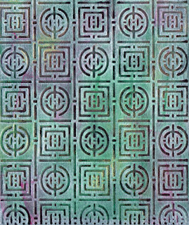 I'd never really used gesso until the last few months but now I'm a real convert, as there seems to be so many ways in which it can be used. If you want a similar effect to the one in the photo, cover black card with a thin layer of white gesso. When it's dry sponge on two or three different inks (I've used red, green and gold, and to be honest, just applied it straight from the pads) I've then just run it through my Cuttlebug, using a folder from Craft Concepts.
Labels:
Background techniques,
Embossing,
Gesso,
Paint
Location:
Riverside TAS 7250, Australia
Saturday, 8 September 2012
RANDOM PAPER STRIPS
This is an easy but effective background. Stack up three or four different patterned papers and secure with a couple of paperclips, then cut into randomly angled strips. Carefully unstack the papers and, using one from each pile in turn, reassemble the strips on a pieces of backing card, leaving a little gap between each. If you are just using up paper scraps these panels are great for backgrounds. If, on the other hand, like me, paper is your favourite supply, you might want to use the technique to show off your collection, and the panel can stand alone and complete "as is".
Labels:
Background techniques
Location:
Riverside TAS 7250, Australia
Saturday, 1 September 2012
STAMPED PAPER CLAY
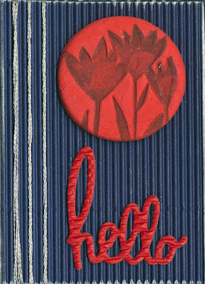 Paperclay is a good medium for adding large components to cards as its very light so even little cards like this won't overbalance. It air dries as well. I've made this gift card from corrugated. The edges are inked with silver and a couple of strands of silver thread are wrapped around as a border. The greeting is a cuttlebug die. The button is paper clay, rolled flat and cut out with a biscuit cutter, then stamped with black ink, using a stamp from Abi's Crafts.
Location:
Riverside TAS 7250, Australia
Saturday, 25 August 2012
FLOWERSOFT WATTLE
Saturday, 18 August 2012
VERY EASY PAINTED BACKGROUND
Two postings in one day! I was asked to put this background up after the recent demo I did. So here it is!!
Its a super easy one - I wanted some background paper on which to mount my pictures of the Pilbara, and so just blobbed some silver, gold and copper straight onto light card (directly from the tube of acrylic paint), and spread it with a brush so that areas blended and the whole page was covered.
For something that took two minutes it turned out exactly as I had hoped, and I'll be making some more.
I scanned it and used it to make up a title too. (Just open another layer over the top of the scanned painted paper, type in your title, select it using the magic wand tool, then cut out the selection to reveal the painted "filling" underneath before collapsing the layers.
LEAF RUBBINGS
 |
| Original Leaf Rubbings |
 |
| "Stamp" |
 |
| Color Burn, Diffuse Glow |
Labels:
Crayons,
Digital techniques,
Rubbing
Location:
Riverside TAS 7250, Australia
Saturday, 11 August 2012
OVERSTAMPING
I'm doing a demo for work that involves ATC styled cards and made this one for that reason. Its about as simple as you can get in this regard. All the stamps came from a Stamp-It uncut sheet, and the technique was just to stamp them, each on top of the other, using a different colour of ink for each. I did have to experiment a bit to get the colours in an order that I liked but all in all its a very quick technique that looks a lot better than I had anticipated i.e. I plan to do this more often. The word "Free" was made with Kaiser alphabet stickers - I didn't have any that looked quite right so I just smeared some black ink over some cream ones. As mentioned, I was doing this for a reason, and I think if I was just making something for myself I'd probably substitute a stamped word for the stickers
Labels:
Background techniques,
Stamping,
Stickers
Location:
Riverside TAS 7250, Australia
Saturday, 4 August 2012
PAINT AND PRINT BACKGROUND
 |
| Hessian Print |
 |
| Onion Bag Print |
I've been printing with paint......nothing too difficult, basically just painting on some Kaiser acrylic paint straight from the tube and then pressing the object onto some light card. The green sample is hessian, the red print was made with an onion bag. Both were a bit hard to press down on "as is" so I covered the painted item with a piece of scrap card and lightly brayered over the top to apply the pressure to print. The rose stamp is from Rubbadubbadoo and was stamped with Staz On onto acetate. The image was then coloured in with a red Sharpie pen.
Labels:
Background techniques,
Paint,
Prints,
Stamping
Location:
Riverside TAS 7250, Australia
Saturday, 28 July 2012
COVERED NOTEBOOK
Its a bit of a cheat to call this a technique, but I was pleased with the results of covering this discount store notebook with some lovely patterned paper, and so thought I'd share. The blue is Bazzill, and the black strip is ribbon, which also doubles as a bookmark. A few black adhesive pearls were used to finish.
Saturday, 21 July 2012
BARGELLO BACKGROUND
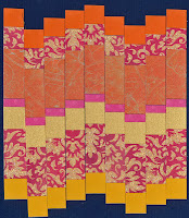
Even although I've labelled this as a background, I think it could stand alone as a card topper. Its the paper version of a well-known quilting technique and I've seen it in all sorts of other places so I make no claim to originality here. I do, however, think its a great way to use up scraps of paper. having said that I think I'll spend a bit longer chosing colours when I use it for a "real" project rather than just as a try-out technique for this blog, as I'm not totally convinced that these ones go particularly well together.
;
;
Labels:
Background techniques
Location:
Riverside TAS 7250, Australia
Saturday, 14 July 2012
LEAF PRINT
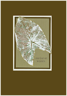 A very long time ago when I lived in PNG I made a little wall-hanging quilt from leaf prints from the garden. I used fabric paint on calico, and did a few trial runs on paper first. I found this one when I was sorting through some stuff in the craft room. I think it might be a taro leaf, but so much time has passed I'm not sure. I do know that lacking any equipment to speak of at the time, I just painted onto the leaf and pressed it with my hand onto the paper/calico. I have scanned it for this example and turned it into a "pretend card" i.e. made on the computer. I had rather forgotten about this very simple technique but think its time to rediscover it. It would be a good way to embellish garden-themed scrapbook pages.
Saturday, 7 July 2012
CUT UP YOUR STAMPS
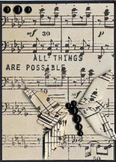 I needed some words to go on this little panel but couldn't find quite the right thing. I saw a Kaiser (and no I don't work for them.....its just that they make some good stuff at a reasonable price so its a bit over-represented in my craft room) stamp that was almost right. It had a religious text that was inappropriate for how I wanted to use this card, and in any case, it wouldn't have fitted in the small space with extra words. A few snips with the scissors later and I had just what I needed. Acrylic stamps (I have just found out) cut really easily, and if you need them as they were they can be somewhat reassembled on a clear block. I'm now revisiting some of the unused text stamps from other sets I own to see how they can be made useful. After all....."All things are possible".
Location:
Riverside TAS 7250, Australia
Saturday, 30 June 2012
MARKER PENS AND GESSO
I quite like the look of coloured embossed backgrounds, but these ones (a Cuttlebug folder and a Couture Creations design), initially coloured with some cheap marker pens were a bit too bright for my liking. Also some of the areas where I'd overcoloured the pen stood out from the rest. A thinnish layer of white gesso saved them from the bin. It toned the colours down nicely and disguised the "dodgy" bits. Unfortunately as I didn't think this would work very well I didn't do a "before and after" scan for comparison, so you'll have to take my word for it! All in all a technique I'll use again - maybe even deliberately next time!!
Labels:
Background techniques,
Colouring,
Embossing,
Gesso
Location:
Riverside TAS 7250, Australia
Saturday, 23 June 2012
KITE-FOLD CARDS
The kite-fold is one of the easiest tea-bag/kaleidoscope folds. Just turn a square on end and bend the sides in to meet in the middle. Eight of them make a circle. I was just using up some of my Kaiser paper left-overs when it struck me how much the choice of colour and pattern affected the end result of what is esentially three examples of the "same" card.
I like the look of the split pin in the middle but if your middle is a bit messy, it doubles as a great disguise.
I like the look of the split pin in the middle but if your middle is a bit messy, it doubles as a great disguise.
Saturday, 16 June 2012
LEMON JUICE EMBOSSING
The picture doesn't really do justice to the results of this technique. All you need to do is rub a cut lemon over one side of your embossing folder. Emboss a fairly sturdy piece of paper or card (neutrals work best) and then apply heat with you papercrafting heatgun.
It will take some time, but eventually the lemon will start to burn and go brown. (It goes without saying that you need to be careful not to set the paper on fire!)
Soon the paper takes on a nice "aged" appearance - great for vintage effects or fun projects E.g. pirate treasure maps!
This is a variation of the old "secret writing" some of us used to do as kids. I can't see why it wouldn't work with stamps but I might leave that for another post.
Saturday, 9 June 2012
SEWING ON STICKERS
There are lots of different ways to add stitching to cards and scrapbook pages. This is a super simple one, as this bag sticker comes with pre-marked patterns.The stickers are transparent so you can chose your background. A plain colour is probably a good choice if you want the sewing to show up. I've cheated and made a digital "sticker" for the "Happy Birthday" greeting, and have used a silvery rainbow metallic thread to complete the design.
Saturday, 2 June 2012
FINGERPRINT BIRDS
There's no reason little people should have all the fun! There are endless critters and suchlike that can be created from finger prints! I've made a couple of birds but you could try making the prints into petals, or add a tail and a couple of ears to make a mouse etc etc etc. I've picked up a bit of paint on my index finger from the background whilst its still wet (underneath the eventual position of the white panel so it won't show) to make the print.
The background is just a combination of green, gold and white paint dabbed fairly randomly onto a piece of black card with a stiff brush for a faux marble effect.
The background is just a combination of green, gold and white paint dabbed fairly randomly onto a piece of black card with a stiff brush for a faux marble effect.
Saturday, 26 May 2012
SHELLMAN
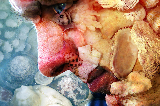
Just for a complete change....here is a
photo I made years ago (yes...I know the idea is to try new things
but when I rediscovered this image I couldn't resist a little “show
and tell”). As a long time passed since I did this, I can't
remember the specific details, but it doesn't really matter as each
photo is unique and will need slightly different treatment to get a
similar result. The process if you want to play, though, is
straightforward. Take two photographs – a close-up of a face
(side-on may work best as there's more skin and less features), and
something for “texture”. My husband who only looks half this
scary in reality was “the face” and the texture was a dish of
shells (you could use a tree trunk or grass or dog fur or pasta etc
etc). In Photoshop or Elements open both pictures and
drag the texture over the face. Try each of the blending modes in
the layers palette until you find one you like. Now you need to
select the eraser and remove the texture from any important details
that may be obscured. This is especially important for the eyes, as
they are the feature that attract most attention. In this case I
then selected the eye and increased the saturation so it was quite
intense, and added a little glint of “light”with the brush tool,
although this is optional. Finally collapse your layers and save the
image. You won't always get wonderful results but its fun playing
around until you find a successful combination.
Saturday, 19 May 2012
PAINT AND SAND EMBOSSING
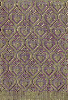 This is a simple background technique. Simply paint a "dyed-through" paper such as Bazzill with a thin layer of a contrasting colour (in this case gold). When it is completely dry, run it through your embossing machine and use an emery board or fine sandpaper to remove the paint from the raised areas.
Saturday, 12 May 2012
COLOURING WITH PENCILS
As I've mentioned, I still have a long way to go before I'll be happy with my colouring skills, but on the off chance that I might improve with practice, I've decided to stop being negative and get on with it! These examples were coloured with pencils (an assortment of brands) and blended with Zest-it. The stamps are from Hampton Art/Graphic 45. I like the effect of the neutral grey around the main image.
Subscribe to:
Comments (Atom)


