Saturday, 28 April 2012

AUTUMN LEAVES


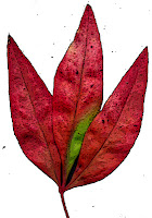
 Well its Autumn!!! I couldn't resist picking some leaves from the garden and scanning them so that I could use them in digital projects. I put a black sheet of card behind so that selecting individual leaves would be easy (using the magic want tool). The individual leaves have been run with the “poster edge” filter in Elements although you could use many of the others to great effect (or just leave them alone!). I've reassembled the single leaves into one composite picture which is a bit kitsch but gives the general idea of the whole copy and paste thing.....I'm sure the leaves could be  used in much more tasteful ways!! (For the keen gardeners....yes there is one ring-in...a Nandina leaf). Feel free to copy the leaves and play.


Saturday, 21 April 2012

3D STAMPiNG


Completed Card

Initial Image
This is a simple 3D card using a Kaiser acrylic stamp.  I first stamped it with black ink onto white paper and then scanned the image, increased the size, and printed it twice onto three different colours of card.
The red was used as a base.  The next layer was cut out of dark pink card around the inner outline (as shown) and the final layer was made up of the inner shape, cut out of cream card.  The cut pieces were assembled on top of each other using double sided tape and two different thicknesses of foam tape.


Saturday, 14 April 2012

CRUMPLED TISSUE PAPER


This is a super easy background that I have seen in several books and on other sites, and yet somehow haven't actually tried out until now. It just seemed too simple.......Now I wish I'd played with this idea earlier. All that it needed is some tissue paper, glue and cardboard backing. Scrumple up the tissue paper (I repurposed some that came with my new shoes). Coat a sheet of card ( I just used 200g white copier card) with glue (I ended up using Aquadhere on the sound grounds that it was sitting on my work table at the time). Then stick the crumpled tissue onto it, retaining most of the wrinkles in the paper. Trim the edges and that it! It looks good enough to use “as is” but you could colour with paint or highlight with ink.

As a digital card/scrapbooking background it can be scanned and easily coloured in Elements by selecting the “Enhance” then “Adjust color” then “Adjust Hue and Saturation”. Tick the colorize box and play around with the sliders until you've achieved the desired colour. 

The thing that I think I'll be doing most often, however, is to use the scanned paper to add texture to photos. Open your scan of crumpled tissue , then open the photo you wish to use. Hold the left button down and drag the tissue scan from the project box onto the photo. Then play with the blending modes until you find one you like.  The Church at the left used "Color Burn" and the one on the right used "Hard Light."

Saturday, 7 April 2012

EMBOSSED ACETATE OVERLAY


I really wanted to use one of my  new World Fair embossing folders with this face stamp (from Rubbadubbadoo) but couldn't quite get it all together.  Embossing can make circles look distinctly dodgy and faces more than a little frightening.

Inspiration struck .......(eventually) and I embossed a piece of acetate and attached it as an overlay.  It worked surprisingly well, so its a technique I'll be using again.

The cogs are Spellbinders dies, the card is made from Bazzill, the split pins are from Regal Craft and the letter stickers and paper are Kaiser.